Role
Lead Product Designer
Type
Ecommerce website
Industry
Building materials
Jewson localised pricing: Turning location into a better experience
TL;DR
Jewson customers were often caught out by location-based price and stock changes. We redesigned the experience to surface local context earlier, using clearer prompts and consistent UI patterns. The result was a shift from confusion to confidence, helping to rebuild trust.

Who is Jewson?
Jewson is one of the UK’s largest builders’ merchants, supplying materials, tools and services to both trade professionals and DIY customers. With a wide branch network and an established online platform, it’s a trusted name in the construction industry. Previously part of the Saint-Gobain group, Jewson is now owned by STARK Group.
My role
I took ownership of the full design approach for location-based pricing, ensuring Jewson customers always saw accurate pricing and stock info at the right moments. I mapped out key journey points, prototyped solutions, validated them with user research, and translated feedback into action quickly.
I collaborated with content, product, development, data and research teams, shaped UI components, and refined messaging. The goal was simple: give users clarity and confidence. No friction. No surprises.
Problem statement
Jewson customers were repeatedly hit by surprise price and stock changes late in their shopping journey, causing frustration and lost sales. Local pricing variations were inevitable, but poor timing and unclear communication were damaging user trust.
We needed to:
Clearly communicate price and stock variations as early as possible
Make local pricing and stock information easily discoverable, without adding unnecessary friction
Restore customer trust and reduce abandoned orders
Research
Data analysis and user insights
User feedback showed consistent frustration around pricing transparency and stock visibility. One desktop user described repeatedly entering postcodes only to discover items were unavailable, saying:
"If you don’t have any stock to sell, don’t display the product in the search results."
Another, using a mobile device, became frustrated after manually selecting bricks page-by-page, only to discover they were out of stock at checkout:
"Going through 16 pages of bricks adding the ones I’m interested in,
only to find they’re all out of stock has properly wound me up. I’m going elsewhere."
These weren’t isolated incidents. They revealed clear, recurring issues:
Users needed to see pricing and stock details earlier in their journey
Users required clarity, accuracy, and simplicity to trust the shopping experience
Personas
Jewson had existing personas, but they needed updating to reflect real user frustrations. Working with the Lead UX and Product Owner, we redefined personas to align with Jewson’s mission to be "easy to do business with".

David, the Traditionalist (50-67 years)
David co-owns a third-generation family building firm. He's traditionally preferred buying in-branch but has shifted online due to recent supply issues.
Expects fair pricing and accurate stock visibility
Prefers face-to-face negotiation and consistent pricing
Bulk purchases frequently, sensitive to last-minute price changes
Pain points
Out-of-stock products and price shifts disrupt planning
No clear visibility of local stock online
Needs accurate pricing upfront to avoid unexpected costs

Samantha 'Sam', the Admin (40-58 years)
Sam handles ordering and admin for her family’s building business. She's responsible for managing bulk orders, comparing suppliers, and ensuring materials arrive on schedule.
Needs accurate upfront pricing for budgeting
Expects consistent pricing across suppliers
Relies heavily on digital tools for stock checks
Pain points
Late-stage price discrepancies make accurate budgeting impossible
Unclear stock levels force extra calls to suppliers
Difficult conversations with customers if projects are delayed by stock issues

Aleksander, the Operator (35-50 years)
Aleksander runs a small building company, blending click-and-collect with regular branch visits. He constantly checks pricing and availability to manage multiple ongoing projects.
Has multiple projects and needs quick access to stock and price info
Compares prices before providing quotes to clients
Relies on accurate local stock data to avoid delays
Pain points
Unexpected price changes complicate quoting and reduce client trust
Late-stage availability issues impact project timelines
Needs upfront stock and pricing clarity to stay efficient
Stakeholder and business
Aside from business-driven localisation needs, there was little direct input during the research phase. Feedback mainly came through the bi-weekly Show & Tell meetings, where I shared updates and took on relevant comments from the wider team. Localisation was one of many projects discussed, but these sessions ensured stakeholders were aware of progress and could provide input when needed.
Competitors review
We explored how others in the building supplies and broader e-commerce space approached location-based pricing and availability. While approaches varied, many competitors relied on postcode entry or store selection, often with inconsistent messaging or unnecessary friction.
What stood out wasn’t a single best-practice model, but a shared lack of clarity. Users were often left unsure how their location affected pricing or product access. That insight shaped our focus. It wasn’t just about implementing location logic — it was about communicating it clearly and building trust early in the journey.
Technical feasibility
To get buy-in on technical implementation, I discussed options extensively with developers. Capturing and retaining location data needed to be frictionless but reliable:
We evaluated approaches including:
Session-based postcode storage: Temporary, but easily lost between visits
Persistent cookies: Retained data, but had privacy concerns and browser limitations
Geolocation prompts: Automated, but often declined by users
Auto IP detection: Seamless, but unreliable for users behind VPNs
Content restriction until postcode entry: Accurate, but can create friction
Each approach had its trade-offs the challenge was finding the right balance between accuracy, usability, and user expectations without adding unnecessary complexity.


Design process
Ideation
Following the discussions with developers I brought them and the colleagues from Content, Data, Product, and User Research together to shape our approach and prioritise tasks for upcoming sprints.
We focused on six key scenarios:
Promoting sign-in
Encouraging users to sign in to personalise their pricing experienceGeolocation
Using browser prompts to capture the user’s location, upon consentActive sessions
Retaining location data during sessions via cookies, reducing repetitive postcode promptsIP location
Auto-detecting location via IP with an easy option to adjustAccount-only access
Showing pricing only to signed-in usersContent restriction
Hiding pricing until a postcode is entered, clearly prompting users at key moments
User flows
After identifying these scenarios, I mapped detailed user flows to demonstrate clearly how each approach would work in practice.
Each flow highlighted:
Entry points: When users first encounter location prompts (sign-in, geolocation pop-ups, IP detection)
Decision points: User choices around location sharing, postcode entry, or continuing as guests
Outcomes: How pricing and stock visibility updated based on user actions
Mapping these flows made it easy to spot friction points, clarify technical requirements, and have meaningful discussions with stakeholders about trade-offs and feasibility.


Prototyping
I quickly moved from sketches to interactive prototypes, skipping extensive wireframing to prioritise speed. Rapid prototyping meant User Research could immediately conduct user testing sessions in UserTesting (formerly UserZoom), validating assumptions and refining the designs ahead of planned A/B tests.
Validation
User testing
To understand how our users experienced the journey, we tested the prototype built on the Content Restriction approach from Scenario 6. In two separate UserTesting sessions, 10 participants in the building trade completed tasks focused on checking availability and setting their postcode.
Checking availability
50% didn’t understand why availability needed checking
Only 4 of 10 noticed pricing and product details updated afterwards
Navigation felt smooth, but messaging about local pricing was too subtle
Setting postcode
All users easily entered their postcode
6 of 10 were unclear why postcode entry was necessary
Half felt visual cues around pricing and availability were too weak
Key insights
The overall journey works, but the reasons behind checking availability and setting a postcode aren’t immediately clear
Participants noted they have seen similar functionality at other retailers
We need to improve the messaging and visual cues to better communicate local pricing and stock details
Iterations and refinements
Initial user testing showed that most users didn’t understand why we needed their postcode or why availability checks mattered.
We introduced a simple postcode modal at site entry and A/B tested three messaging variants:
Find products local to you (control)
Where are you?
Where is it going?
"Where are you?" performed best, converting at 4.6%, capturing 10,000 postcodes. A follow-up geolocation prompt test captured 29,000 postcodes (mainly mobile), but had a lower conversion rate of 1.6%, indicating users responded better to clear, direct messaging.

Postcode modal variant and Adobe Analytics snapshot.
Visual cues
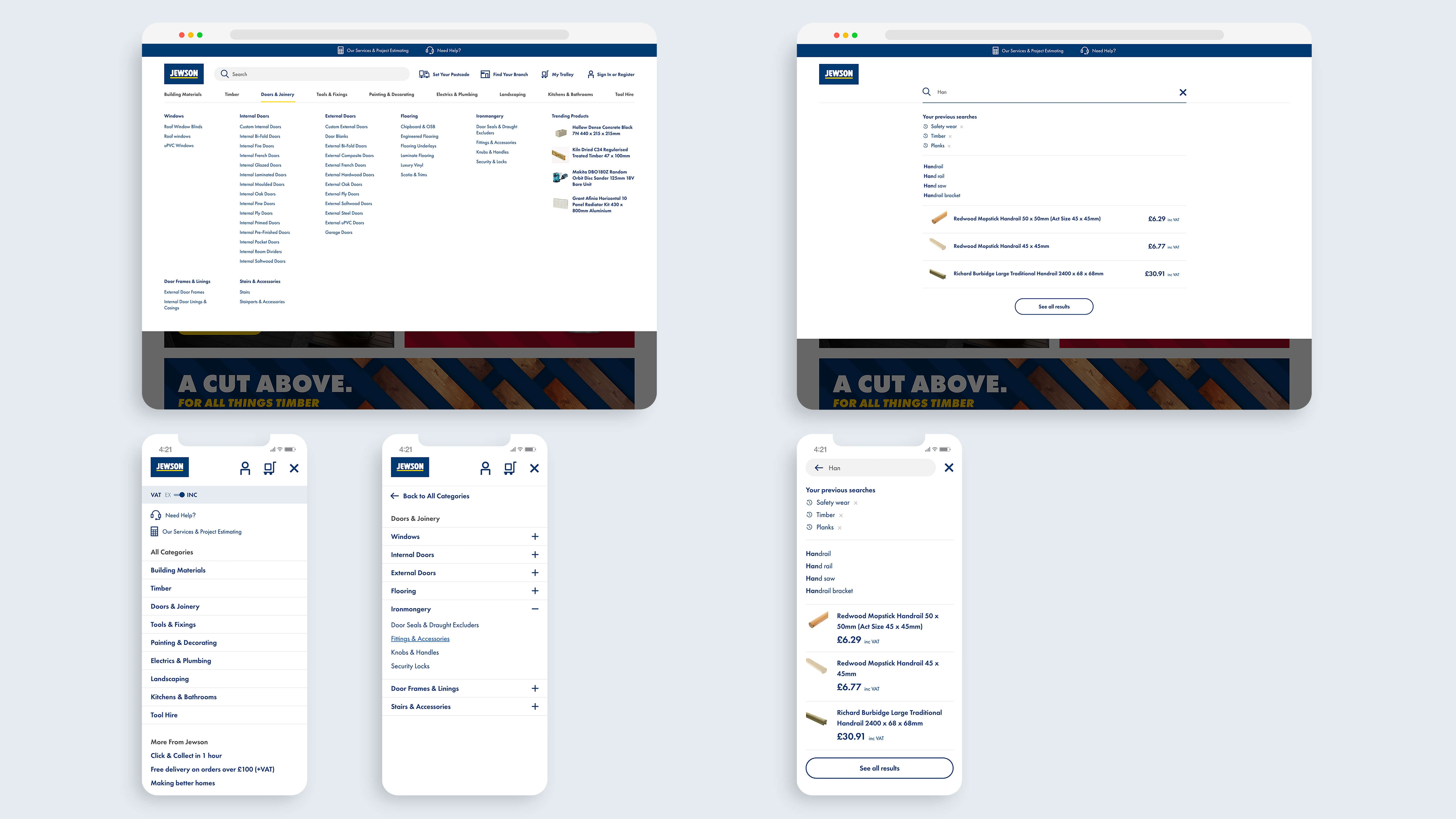
Original text-based prompts weren't noticeable enough, only 2 of the 10 initial testers spotted the location filter. To fix this, I introduced a clear location toggle in the product list filters. Clicking it expanded a drawer, enabling easy postcode entry without another intrusive modal. I also added a tooltip appearing once on first visits, which helped users spot the filter naturally, without breaking their journey.
The results:
18.5k users shared their location (72% on mobile)
1.8% improvement in conversion rates


Tooltip across devices to help with signposting and early concepts for IP location prompts to show scalability of the component.
Sign-in prompts
In another test (Scenario 1), we repurposed the effective tooltip, positioning it on product detail pages (PDP) and the navigation header, nudging users towards signing in:
89% increase in "Sign in" clicks
6% of sign-ins came directly from PDP prompts
Overall sign-ins increased by 5%
11% increase in orders from returning customers
Given these strong results, we integrated the tooltip into Jewson’s global design system.

Content restriction
Our final A/B test applied Scenario 6: we blurred product pricing on PDP pages until users entered their postcode. Stakeholders were initially worried this might push customers away. With the help of Marketing and Content, we placed clear, reassuring messages around local pricing across the homepage and product listings to reduce the risk.
Instead of driving users away, the blurred pricing had a clear, positive impact:
49% increase in postcode submissions (from 4.7k to 7k)
700 fewer products added to baskets without postcode validation
A significant drop in users encountering unavailable items, down from 35% to 23%
This confirmed that customers appreciated clear communication, even if it required an extra step.

Results
Lessons learned
Early user testing was a valuable reality check. I initially thought subtle prompts would do the trick, but they weren’t enough users needed explicit clarity about why we were asking for their postcode. Once we simplified our messaging, the impact was immediate.
Most valuable lessons:
Be clear, not clever: Users appreciate direct communication for critical actions
Value over friction: People are happy to take extra steps if the payoff is clear and immediate
Reuse and refine: Leveraging consistent design patterns (like our new tooltips) improved usability everywhere, reducing complexity and boosting engagement
Impact
Users now know exactly why we’re asking for their location, removing that ‘what’s going on?’ moment at checkout. By showing prices and stock details earlier, we turned a point of friction into one of trust helping people shop confidently and complete purchases without frustration.
What we achieved:
49% more postcode submissions, reducing unwelcome checkout surprises
1.8% uplift in conversions by surfacing local pricing clearly
89% more sign-ins, leading to 11% more returning orders
Fewer abandoned baskets, as pricing and availability were surfaced at the right moment
Reduced calls and queries to branches because customers found accurate info online
These design improvements, including postcode prompts, intuitive tooltips, and timely sign-in nudges, have become core components of Jewson’s digital experience.
Next steps
While testing different localisation scenarios, we also began redesigning the site’s navigation. Like many e-commerce sites, the goal was to introduce a permanent space in the main header where users could set their location and branch. This would bring local pricing tools into clearer view from the start.
During Phase 1, I supported another Product Designer as they delivered the visual execution, mentoring them throughout. This version introduced sign-in prompts and improved access to location tools, which tied in closely with the postcode and content restriction work. Early results showed strong engagement:
3% more searches
8% more product views
21% more products added to baskets
7% more completed orders
I went on to design Phase 2, which included a dedicated area for managing branch and location details. The design was built from scalable components in Jewson’s multi-brand design system and directly addressed feedback from mobile users. Although development was paused due to shifting priorities, the designs remain ready for future use.

Jewson Phase 2 header with dedicated localisation functionality in top navigation.
Jewson Phase 2 header updated search and menu structure.
