Role
Lead Product Designer
Type
Ecommerce website
Industry
Building materials
Jewson homepage promo: From carousel to conversion
TL;DR
Jewson’s homepage carousel wasn’t delivering results. I redesigned the promotional space as a flexible grid that was easier to update and better aligned with user behaviour. Using Adobe Analytics and A/B testing to validate the design, we saw a clear increase in sign-ups and engagement.

Who is Jewson?
Jewson is one of the UK’s largest builders’ merchants, supplying materials, tools and services to both trade professionals and DIY customers. With a wide branch network and an established online platform, it’s a trusted name in the construction industry. Previously part of the Saint-Gobain group, Jewson is now owned by STARK Group.
My role
As Lead Product Designer in the internal Jewson Optimisation Team, I focused on creating a user experience that solved real problems and supported business goals. The design needed to be clear, testable and scalable across the wider STARK UK portfolio.
It was a hands-on role where I worked closely with User Research, the Product Owner, Business Analyst, content specialists, external developers and senior stakeholders. I kept the Director of UX and key decision-makers informed throughout, managed feedback loops and helped maintain momentum across multiple teams.
Problem statement
Jewson’s homepage carousel was frustrating users and undermining business goals. Most visitors only saw the first slide, leaving other promotions unnoticed and limiting potential revenue. User feedback confirmed clear annoyance with the auto-rotating banners.
We needed a new approach that could:
Engage visitors immediately without timed rotations
Clearly present multiple promotions at once
Drive more account sign-ups without complicating the journey
"It’s annoying that the big banner slides away before I can read it."
– Jewson.co.uk user feedback
Research
Data analysis and user insights
Working with the data team, I analysed Adobe Analytics and heatmap data to dig deeper into carousel performance. We saw clearly that most visitors never clicked beyond the first slide, confirming why engagement was low and homepage-driven conversions were limited.


Stakeholder and business
I spoke with stakeholders across marketing, product and the wider business to understand what they needed from the space. Marketing wanted flexibility to showcase more promotions. The business wanted clearer links to account sign-ups and revenue. These priorities often pulled in different directions, and it was up to me to find a solution that worked for both.
Competitors review
I did a quick review of other e-commerce and trade platforms to pressure-test our thinking. Most had moved away from carousels in favour of static grids or promo tiles, reinforcing what our own data was already telling us: users engage better when content is visible upfront, not hidden behind rotation.
Technical feasibility
During the research phase, I made sure to talk with developers to understand the technical constraints within Jewson’s SAP Hybris architecture. While the A/B test was run through Adobe Target, it still required front-end development for integration and tracking. These conversations helped confirm that my thinking was on the right track and would hold up from a technical point of view.
Key considerations were:
Front-end integration
The test needed to sit within the existing homepage structure, while giving marketing and content teams the ability to update promotions without relying on developer inputScalability
If successful, the new layout would move into the core SAP Hybris workstream for long-term implementationPerformance
To maintain fast page loads, especially for returning users, we needed to avoid unnecessary API calls or database queries
Design process
Ideation
Based on user insights and stakeholder priorities, I explored three potential approaches for the homepage promotional space:
Refining the existing carousel to encourage better user interaction
Replacing it with a single, bold, static promotional banner
Introducing a structured grid to showcase multiple offers at once
After reviewing data insights, feedback from the Optimisation Team and key stakeholders, the structured grid emerged as the best option. It offered more visibility and flexibility without overcomplicating the design.
Wireframing
I began by sketching low-fidelity concepts for the grid layout, exploring different arrangements ranging from simple 2x2 blocks to more complex mixed formats. As the design evolved, I iterated on these concepts with input from marketing, stakeholders, and developers.
After presenting back to the team the various concepts, we chose the 4 evenly sized blocks version as our challenger variant against carousel.

Prototyping and visual design
Since the concept was straightforward, I focused on high-fidelity static designs rather than interactive prototypes. I introduced the "White World" concept, replacing the old grey background with a neutral canvas to improve accessibility and readability.
There was some hesitation from stakeholders, as the existing styling wasn’t seen as “broken.” However, I advocated for the change, explaining how it would create a cleaner, more modern look and improve clarity across the homepage grid and the rest of the site.
In addition, I reduced the font weight from Futura PT Extra Bold to Demi in key areas, improving legibility and reducing visual strain, particularly for users scanning content across dense layouts.
Validation
User testing
We ran an A/B test in Adobe Target, comparing the new structured homepage grid 2x2 (challenger) to the existing carousel (control). Traffic was split evenly, and we tracked key metrics over two weeks:
Week 1 results
66% increase in homepage click-throughs
1.5 percentage point bounce rate reduction
Grid interactions generated ~50% of homepage revenue
Week 2 results
33% additional increase in banner clicks
0.4% conversion rate increase
Continued reduction in bounce rate
Projected annual revenue uplift of £180k–£240k
Iterations and refinements
Although the new grid significantly boosted engagement, account sign-ups remained an issue, with many visitors dropping off before completing registration. In response, I focused on three areas to address these gaps in Phase 2:
Testing alternative grid layout(s)
Personalisation to drive more relevant sign-ups
Redesigning the account registration flow
1. Testing alternative grid layouts
The 2x2 grid was an improvement, but data showed that on smaller screens, part of the grid wasn’t visible, limiting promotion exposure. I tested three alternative grid layouts to improve visibility:
Variant 1: Control 2x2 grid layout
Variant 2: Only horizontal content blocks (5 banners)
Mixture of horizontal and tall vertical content blocks (tall banners)
In the first two weeks, the 5-banner layout outperformed the others in engagement, reducing bounce rates and driving more clicks.
Week 1 results
47% more clicks than the 2x2 grid
Bounce rate dropped from 7.7% to 6.9%
Increased homepage-driven orders
Week 2 results
28% more clicks than the control
33% more than the tall banner layout
Bounce rate continued to drop to 6.5%
With a 39% increase in clicks and £9k in additional revenue by week four, the 5-banner layout was adopted as the new homepage standard.

On the left the control 2x2 variant, followed by the '5 banners' and 'tall banners' challenger variants.
2. Personalisation to drive more relevant sign-ups
To improve conversions, we introduced dynamic messaging based on user type. For example, cash account holders were prompted to upgrade to a credit account, while first-time visitors were encouraged to sign up for a Web login.
Our segmentation:
Web login: Online use only, access to order history and saved payment details
Cash account: Pay-as-you-go options, exclusive pricing, in-branch and online use
Credit account £10k interest-free credit, lower prices, online account management
Customising the calls-to-action based on user type resulted in better engagement and a significant increase in sign-ups.
A/B Test results
52% more account logins
30% rise in completed cash account applications
Higher average order value
Credit application conversions rose by 0.3% (from 0.01%)
By adapting calls to action based on user segmentation, we achieved higher engagement and stronger sign-ups, effectively closing one of the biggest gaps from Phase 1.

3. Redesigning the account registration flow
While the new homepage drove more traffic to sign-up, the registration process was still a pain point. Visitors were dropping off, particularly on mobile. The outdated form design didn’t match the modern look and feel of the homepage, leading to user frustration.
I streamlined the form layout for easier scanning, reduced the scrolling and cognitive load on mobile, and aligned the visual design with the new homepage grid. This improved the user experience and provided insights for future full-registration enhancements.
A/B Test results
Mobile completion rates improved by 3 percentage points
Desktop completion rates rose by 4 percentage points
Mobile bounce rate dropped from 43% to 34%
Desktop bounce rate dropped from 19% to 16%
Conversion rates increased by 2 percentage points
Revenue impact increased by 44%, with an 84% increase in average order value
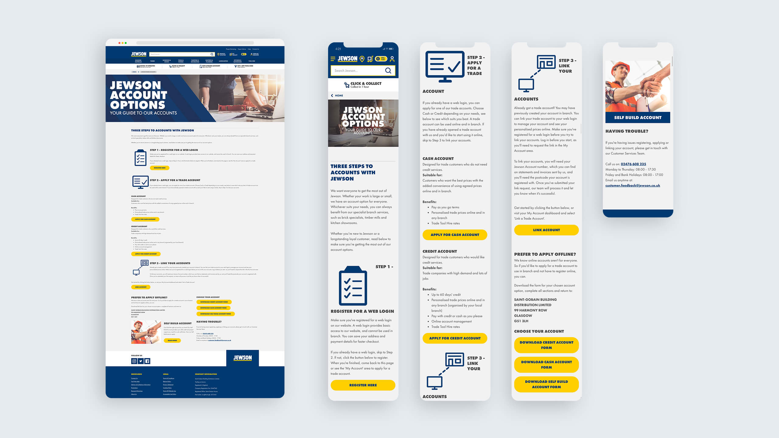
Jewson pre-optimised account page.

Jewson new post-optimised account page.
Results
Lessons learned
This project delivered clear wins. Balancing speed with impact was challenging but valuable. Next time I’d focus more on:
Early mobile testing
While mobile performance improved in Phase 2, earlier testing could have highlighted issues sooner. Running mobile-first A/B tests alongside desktop versions and using heatmaps and click tracking earlier would help gauge content visibility on smaller screensA more dynamic grid
The five-banner layout was effective but static. Future designs could benefit from a grid that adapts based on user behaviour, account type, or browsing history, with content placement tailored to high-engagement categoriesEnhanced accessibility
While the grid meets basic accessibility standards, there’s room for improvement. Fully coding the banners would allow for dynamic typography, better readability (for screen readers), and micro-interactions to enhance engagement without overwhelming users
These insights have influenced my approach in subsequent projects, enabling me to adopt a more proactive, data-driven design process that anticipates challenges and prioritises user needs.
Impact
The homepage now features a clean, five-banner layout that highlights key promotions, account benefits and products. Replacing the old carousel made content easier to find and led to stronger results.
The project was a strong collaboration between internal and external teams, with clear impact:
66% increase in homepage click-throughs
1.5 percentage point drop in bounce rate
£180k–£240k projected annual revenue uplift
30% more completed account sign-ups
52% increase in account logins, supported by personalised CTAs
It didn’t just improve performance. It helped shift the mindset from legacy habits towards a more user-focused, data-informed approach.

